
Accessible Text Content
Use the appropriate tools available to get the best results when arranging your text information.
Normal Text
The regular text of your webpage or document should be arranged in paragraphs.
Avoid large blocks of colored text, underlined text, decorative fonts, italicized text, and capitalized letters. Large blocks of these types of text are difficult to read.
To add emphasis, format the text as needed with bold and italics. Avoid underlining text for emphasis (web users expect underlined text to be a link).
Tables should not be used to arrange the layout of a page. See Table Accessibility for details.
Lists
Lists should be created using the tools included in Word or the online system. Manually adding numbers or bullet characters at the beginning of every line item won't allow assistive technologies to understand that your information is a list.
List tools in Word: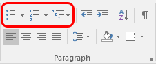
List tools in Blackboard: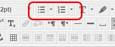
Fonts
Fonts for Documents
Regular paragraph text should be at least 12 points to ensure legibility. Footnotes or endnotes should be a minimum of 9 points. For slideshow files (e.g. PowerPoint), normal text should be at least 24 points, and headers and subheaders should be between 40-60 points.
Fonts for Web Content
Avoid selecting custom fonts and sizes for web content. The website system already includes accessible styles for all the common types of content. When the basic structural elements are used (headings, paragraphs, lists, etc.) the proper formatting is applied automatically.